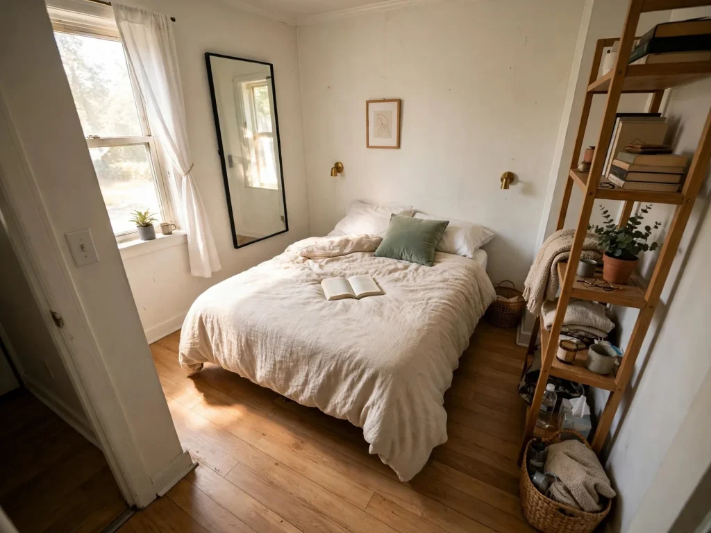
A moody bedroom works when the dark color wraps deliberately: walls in a deep shade with a matte or eggshell finish, warm 2700K light layered low and textiles that repeat the wall color so the room reads cocooning rather than cave-like. Keep the ceiling light or one wall pale if the room is small or north-facing.
Your bedroom is bright, flat and a little bit hotel and not in the good way. You keep saving dark, wrapped, quiet rooms, the kind that look like a deep breath and then you talk yourself out of them with the same two fears: it will feel like a cave and it will make the room smaller. Both fears are reasonable. Both are also about execution, not color, because every cave-like dark bedroom you have ever walked into broke the same three rules: the darkness stopped in the wrong place, the light stayed cool and high and nothing pale was left to give your eye a rest.
This page is organised around the decision nobody else helps you make: how dark to go and where the dark stops. First a short scale of darkness levels, because that choice comes before any paint name. Then 19 ideas in the order they build on each other: choose the depth, build the cocoon, light it warm and fix the things that go wrong. Every palette names real paints and the whole system connects to our bedroom color ideas page if you want the lighter families too.
Before you start: how dark can you go?
Moody is a dial, not a switch. Level 1 is one dark wall, the bed wall, with the rest of the room pale. Level 2 is the dark color on two walls or wrapped into an alcove or a panelled section. Level 3 is all four walls deep, with the ceiling kept light. Level 4 is the drench: walls and trim in the same color, ceiling still light. Level 5 is the full cocoon, ceiling included and it belongs in rooms with height or strong lamps.
Two facts pick your level for you. The first is your light: a south-facing room with a big window can carry two more levels than a north-facing box room with a slit of glass. The second is your nerve and it is allowed to grow: levels are reversible in an afternoon and most people who try Level 1 in October are painting Level 3 by spring. Start one level below the one you want. The room will tell you if it wants more.
Measure: before choosing, note which way your window faces and how many hours of direct sun the room gets. That answer, not the swatch, sets your level.
One more asset to inventory before you choose a level: your existing furniture’s temperature. A room full of warm wood and brass is pre-adapted to moody; a room of chrome, glass and gray-washed wood will need its metals and woods warmed (idea 12) before any deep color looks like the photographs.

Choose your darkness: the palette commits
1. Near-black, warmed up: the charcoal family
The safest deep is a near-black with warmth or blue inside it, never a true neutral black, which goes flat and chalky on a wall. Sherwin-Williams Iron Ore SW 7069 is a soft charcoal-black that behaves in most lights; Benjamin Moore Wrought Iron 2124-10 leans a touch bluer; Farrow & Ball Railings No. 31 is the famous one, a blue-black that reads almost navy in daylight and near-black at night.

Charcoal is the level-anything color: it works as a single bed wall and it works as a full drench, which is why it is the right first deep for most people. Pair it with warm white bedding and one warm wood and the room cannot go cold.
Budget: one wall at Level 1 takes a small tin. Charcoal is also the cheapest depth to test, because sample pots read honestly.
2. Navy: the deep color that behaves like a neutral
Benjamin Moore Hale Navy HC-154 and Sherwin-Williams Naval SW 6244 are the two navies that show up in real homes year after year, because navy does something no other deep does: it reads as a color in the morning and as a neutral at night. If your partner fears the cave, navy is the negotiation that ends the argument.

Navy asks for warm partners: cognac or tan leather, warm wood, brass. It sulks next to gray-washed wood and cool gray textiles, which drain it. Keep the bedding warm white rather than bright white; the contrast should glow, not glare.
Measure: navy darkens about a shade between the card and a full wall. Buy the sample, paint the board, judge it at night.
A note on partners. Two people, one cave fear: navy is your peace treaty. It photographs as a color in listings and behaves as a neutral at midnight. Nobody has ever lain awake resenting navy. That safety is worth the small loss of drama.
3. Deep green: the cocoon with a pulse
Farrow & Ball Studio Green No. 93 is the benchmark deep green, almost black in low light and unmistakably green at noon. Sherwin-Williams Pewter Green SW 6208 is its softer American cousin, grayer and easier in small rooms. Green is the moody color with the widest comfort range, because humans read it as shelter: it is the color of being under trees.

Green also forgives mixed woods better than any other deep. Walnut, oak and painted furniture all sit happily against it and brass reads as jewelry on it. If your room has plants, green walls make them look deliberate instead of scattered.
Budget: deep green is the palette where the textiles version works best; a green duvet and curtains on pale walls gets you halfway for the price of bedding.
4. Burgundy and plum: the romantic deeps
Farrow & Ball Brinjal No. 222, a deep aubergine-plum and Benjamin Moore Shadow 2117-30, a violet-charcoal, are the deeps for people who want warmth with their drama. These colors do at night what candlelight does: they flatter skin, soften edges and make a room feel occupied even when it is empty.

They are also the least forgiving of cool light. A burgundy room under a 4000K bulb goes brown and tired; under 2700K it glows like wine. If you choose this family, the lighting ideas below are not optional garnish; they are half the palette. Our bedroom lighting ideas page covers the bulb and placement rules in full.
Renter-friendly: burgundy is the best textiles-first deep. A velvet duvet in wine red against warm white walls delivers most of the mood with zero paint.
5. The brown-black depths: espresso, umber and the warm darks
The newest deeps are not black at all but browns so dark they behave like it: espresso, umber, bitter chocolate. Benjamin Moore’s brown-black family and Sherwin-Williams Urbane Bronze SW 7048, its 2021 Color of the Year, live here. These are the deeps for rooms with warm wood floors and leather, where a blue-black would fight the floor’s temperature.

Brown deeps never read cold, which makes them the north-facing room’s best dark option. Their risk is the opposite: with warm light and warm wood and warm textiles, the room can go muddy. One pale element, bedding or a rug, is not optional in this family; it is the contrast the whole scheme hangs on.
Measure: hold the paint board against your floor before committing. If floor and wall are the same temperature and depth, lighten the wall one step.
Build the cocoon
6. Drench deliberately: walls and trim in the same color
The single move that separates cocoon from cave is carrying the wall color over the trim, skirting and door on the walls you paint. White trim chops a dark wall into a framed rectangle and makes the room read as a pale room with dark panels. Same-color trim lets the wall become a continuous surface and the room’s edges soften.

You do not have to drench the whole room. Drenching one zone, the bed wall and its returns, gives most of the effect at Level 2. Save the ceiling decision for last; it is the easiest element to add later and the hardest to undo emotionally.
Needs drilling: no. This is paint only. It is also why the drench is the renter-excluded move; landlords notice trim.
7. Choose matte or eggshell, because sheen kills mood
Gloss is the enemy of depth. A satin or semi-gloss dark wall reflects every lamp as a hard white streak and shows every roller mark and the color reads cheaper and colder. Matte and flat finishes absorb light and let a deep color sit quietly; eggshell is the practical compromise for walls that need wiping.

The trade-off is real: matte marks more easily and touch-ups can flash. In a bedroom, where walls are touched less than in a hall or kitchen, the trade is worth it. Keep the leftover paint for the inevitable scuff.
Budget: finish costs nothing extra. It is chosen at the tin, not bought as an upgrade.
One practical warning. Matte shows scuffs. Dark matte shows them lighter, as pale marks. Keep a small pot of the color and a foam brush in the room itself and a touch-up takes ninety seconds. Hotels do exactly this. The walk to the garage is what makes people stop touching up.
8. Repeat the wall color in the textiles, at least twice
A dark wall with all-pale textiles looks like an accent wall that got ambitious. The wrap the answer capture describes happens when the wall color reappears in the room: a cushion in the same depth, a throw at the foot, curtain panels in the family. Two repetitions minimum, three for a full drench.

The repetitions do not need to match exactly; a shade lighter or deeper in the same family reads as layering, which is better than matching. Flat, exact matches across paint and fabric look like a hotel chain’s idea of moody.
Budget: the repetitions are small textiles. One cushion cover and one throw carry a whole room’s wrap.
9. Keep one pale release: the bedding, the ceiling, or one wall
Every successful dark bedroom has exactly one place where the eye rests in lightness and it is a design element, not a failure of nerve. Warm white bedding is the usual release and the best, because it also makes the bed the brightest object in the room, which is where you want the attention.

Small and north-facing rooms should take two releases (bedding plus ceiling) and drop a level. If everything is deep, nothing is; contrast is what makes darkness visible as a choice rather than an absence of light.
Measure: as a rough guide, keep about a third of what you see from the doorway in the pale range at Levels 3 and below.
10. Hang heavy curtains in the wall's depth family
Moody rooms need curtains with physical weight: velvet, a linen blend with lining, or blackout panels in a color near the walls. When the curtains join the wall’s depth family, the window stops being a pale hole in the scheme at night and the room stays wrapped after dark, which is when a moody bedroom does its work.

Hang them high and wide as always and let lined panels fall to the floor. In the day they frame the window in depth; at night they close the cocoon.
Budget: curtains are the second-biggest textile cost after bedding. Their color family matters more than their fabric.
11. Stack textures until the room feels upholstered
Dark colors flatten texture visually, so a moody room needs more of it than a pale one: velvet against linen, a wool throw on smooth cotton, a jute or vintage-look rug underfoot, one piece of raw or aged wood. The test is what the room would feel like with your eyes closed.

If everything is smooth, the room reads as a painted box. Add the roughest thing first (usually the rug or a woven throw) and the rest of the stack gets easier to judge.
Budget: texture is the cheapest layer in any scheme and thrift stores are full of wool and velvet.
12. Warm the metals and the wood: brass, bronze, walnut
Chrome and cool gray metals go clinical against deep walls. Brass, aged bronze and warm woods (walnut first among them) catch lamplight and return it warm, which is the entire physics of why some dark rooms glow and others brood. Repeat your warm metal at least twice: lamp bases and a frame, handles and a tray.

You do not need to replace furniture. A walnut tray, a brass lamp pair and wooden frames move a room’s temperature more than their size suggests.
Budget: under $50 at thrift prices for the lamp pair that does most of this work.
Light it warm
13. Purge every cool bulb; 2700K is the law in here
One 4000K bulb can unmake a moody room nightly, turning plum muddy, green gray and navy black in the bad way. Every bulb in the room, lamps, ceiling, the lot, goes to 2700K warm white. This is a $15 idea that outranks several paint decisions on this page, because the color you chose only exists under the light you chose.

Check the ceiling bulb even if you rarely use it. Guests and cleaners switch it on and it will betray you.
Budget: bulbs for a whole room run about $15 to $25. Do this before the paint and judge your samples under it.
14. Move the light low and turn the ceiling off
Moody rooms are lit from lamp height, not from the ceiling. Bedside lamps, a dresser lamp, maybe a floor lamp in the corner: pools of warm light at sitting height, walls glowing at their middles, ceiling in soft shadow. The overhead light is for finding earrings and cleaning day.

If your only light is overhead, this idea is your first purchase, before paint. A dark room lit from above is a cave with good intentions; the same room lit low is a cocoon.
Budget: one lamp pair transforms the light structure. Thrifted, with new warm bulbs, under $50.
Judge the result at night, from the bed. That is the view the system is built for. If the ceiling still draws your eye, it is too bright or too white. Fix the bulb, not the paint. The walls are rarely the problem people think they are.
15. Put the lamps on dimmers and learn the fade
A dimmer turns one room into two: bright enough to get dressed, low enough to end the day. Plug-in dimmers work on most lamps without any wiring and one smart bulb in the main lamp does the same job from your phone. The fade at night is most of what people are actually picturing when they say they want a moody bedroom.

Set the evening level once, lower than you think and live with it for a week before raising it. Eyes adjust downward happily; rooms rarely need as much light as habit claims.
Renter-friendly: plug-in dimmers and smart bulbs leave no trace. This is the renter’s lighting upgrade.
16. Add the candle layer, flameless where it must be
The last layer of light in a dark room is the smallest: candles or their flameless equivalents on the dresser, a lantern in the corner. At this depth of wall color, a few points of flickering warm light do what they do in every painting of a beautiful interior, they make the darkness look chosen.

Real candles belong away from curtains and bedding, in hurricanes or jars; flameless ones with timers belong everywhere else, including the shelf you forget to switch off.
Budget: a trio of flameless candles with a timer runs about $15 and works every evening without being lit.
Finish it and fix it
17. Hang art that can hold its own against the dark
Pale, delicate art disappears on deep walls. Moody rooms want art with its own darkness or its own glow: landscapes with shadow in them, portraits, abstracts with deep grounds, all in frames with presence (dark wood, aged gold, or a pale frame used deliberately as part of the release). Scale up; the wall can take it.

One large piece over the bed at two-thirds of the bed’s width still holds. On a dark wall, a wide pale mat inside the frame can serve as the art’s own release, echoing the bedding.
Measure: on deep walls, go one size larger than the pale-room rule. Small art does not read as minimal here; it reads as lost.
18. Smuggle the mood into a rental: the no-paint version
No paint is not no moody. The rental version runs on three swaps: a deep duvet and matching cushions (idea 4’s burgundy, or charcoal or navy), curtains in the same depth family hung as high as the rod allows and every bulb changed to 2700K with the lamps doing the work. Add a dark throw over the chair and the room’s center of gravity drops two levels without a single wall changing.

What you lose is the wrap; what you keep is the palette and the light, which between them are most of the effect. When you move, the whole scheme packs into two boxes. Our main bedroom ideas pillar runs the rental playbook across every style, not just this one.
Renter-friendly: completely and it is the version to try for a season before you would ever ask a landlord about paint.
19. Test like a skeptic: the board, the evening, the one-wall trial
Dark colors betray more than pale ones between the card and the wall, so the test protocol matters most exactly here. Paint a foam board, at least 2 by 2 feet, move it around the room and judge it at the hour you use the bedroom most, under the 2700K bulbs you will actually live with. A color you love at noon can be the one that goes dead at nine.

Then paint one wall and live with it a week. Level 1 is a legitimate permanent answer for many rooms and if the wall keeps asking for company, you have your verdict with evidence instead of anxiety.
Budget: a sample pot and a board cost under $10. It is the cheapest insurance in the entire project.
Do not skip the week. Paint fumes fade in a day. Doubt takes longer. A color you have lived beside through a work night, a slow Sunday and one bad mood has passed the only review panel that matters. Yours.
How each palette behaves in north and south light
The same deep paint is two colors depending on which way your window faces and this is where most moody projects quietly go wrong. South-facing rooms get warm, direct light that enriches everything: blues stay true, greens glow and even near-blacks keep their softness. If your room faces south, you can take any palette on this page at the level you want and your main job is stopping glare with lined curtains at midday.
North-facing rooms get cool, indirect light all day and it taxes every palette differently. Navy slides toward black and can lose its blue entirely by evening; judge it by lamplight or do not judge it at all. Charcoal goes cooler and flatter, which is when the warm textiles earn their place. Green holds up best of the cool deeps, because its yellow component survives northern light. The warm families win outright here: burgundy, plum and the brown-blacks actually gain richness in cool light, the way a fire gains from a dark room. This is why idea 5 calls the brown-blacks the north-facing room’s best dark: the light and the color are working the same side.
East-facing rooms are south in the morning and north by night, which for a bedroom means the evening verdict matters most. West-facing rooms get the golden hour in full and a deep green or navy west room at sunset is the single best advertisement this style has.
The ceiling decision also follows the light. In a south-facing room, a pale ceiling bounces warm light back into the scheme all day, so keeping it light costs the mood nothing. In a north-facing room the ceiling contributes almost no useful light, which is why northern rooms are the safest candidates for the full Level 5 drench: you are giving up brightness you never actually had and gaining the complete cocoon in exchange.
The same palettes on a budget
Moody is unusually kind to small budgets, because its main ingredient is one paint color and its second is bulb temperature. The full ladder: under $50, change every bulb to 2700K and buy the sample pots to test properly; the room is not moody yet, but its light finally agrees with the plan. Around $100, add the Level 1 version: one bed wall in your chosen deep, matte finish, with the trim on that wall painted to match. Around $250, the wrap begins: the duvet and cushion set in the wall’s family (idea 8), one pair of warm-metal lamps, thrifted and the throw that repeats the color at the foot of the bed.
The textiles-only version (idea 18) costs about the same $250 and skips the paint entirely. Notice what never appears on the ladder: furniture.
The top rung, around $500, is the full Level 3 or 4 room: paint for all four walls and the trim, the curtain panels in the wall’s family (idea 10) and the texture stack completed with a real wool or vintage-look rug. That is the whole transformation, finished, for less than a mid-range bed frame. Moody is a surface-and-light style and the dresser you already own will look more expensive inside it than a new one looks in a pale room you have not finished.
Moody bedroom ideas for a small, dark room
The small, north-facing room is where readers assume moody goes to die and it is actually where a disciplined version shines, with three adjustments. Drop one level from what you want (Level 2 or 3, not 5), take both releases (pale ceiling and warm white bedding, non-negotiable) and put your depth in the warmest family your taste allows (the brown-blacks of idea 5 or a warm green), because cool deeps in a sunless room go cold by November.
Keep the texture stack (idea 11) and skip the heavy curtains if the window is the room’s only light source; lined linen instead of velvet. The result is not a smaller-feeling room. It is a room whose edges you stop noticing, which in a small bedroom is the same thing as space.
And keep the door test in mind. Stand outside, open the door, look in. A small dark room that glows warm beats a small pale room that glares. Every time. Visitors will say the room feels calm. They will never say it feels small.
Mistakes that make it fall flat
Ranked by how reliably they produce the cave:
- The accent wall with white trim and pale everything. One dark wall, chopped by white woodwork, surrounded by a light room, reads as a backdrop, not a mood. Drench at least the zone (idea 6) or go textiles-first instead.
- Cool bulbs. The fastest way to make a good color look cheap. 2700K or the palette does not exist (idea 13).
- Sheen. Satin dark walls streak with reflected light and show every flaw. Matte or eggshell (idea 7).
- No pale release. All deep, all the time and the eye has nowhere to rest; darkness stops reading as depth and starts reading as absence (idea 9).
- Stopping at the walls. Paint changed, textiles unchanged, light unchanged: a dark shell around a pale room’s contents. The wrap is the room (ideas 8, 10, 14).
- Judging the color at noon. Moody rooms are evening rooms. Test at the hour of use, or do not trust the test (idea 19).
Questions people ask about this
What is the best color for a bedroom walls and bedding together? The systems that work pair a deep wall with bedding inside the same story: Hale Navy walls with warm white and cognac, Studio Green with cream and walnut, Iron Ore charcoal with white and one warm wood. The bedding is usually the pale release, one or two tones of texture rather than a second strong color competing with the walls.
Do dark colors make a bedroom look smaller? They make the edges less visible, which most people experience as cozier rather than smaller, especially with a pale ceiling and bedding. What genuinely shrinks a room is patchwork: one dark wall cut up by white trim. A wrapped dark scheme reads as one calm volume; a chopped one reads as a small room with a dark rectangle in it.
What paint finish is best for bedroom walls? Matte or eggshell for deep colors. Matte absorbs light, lets the color sit quietly and hides roller marks; eggshell trades a little depth for wipeability. Avoid satin and anything glossier on a deep wall: the sheen reflects lamps as hard streaks and makes the color read colder and cheaper than the same paint in matte.
How do I test a paint color before committing? Paint a foam board at least 2 by 2 feet, not a patch on one wall and move it around the room for a full day. Judge it in the evening, under the warm bulbs you will live with. For a deep color, finish with a one-wall trial week before painting the rest.
The bottom line
Moody is not a color; it is a wrap, a light temperature and one pale place for the eye to rest. Choose your level honestly, drench at least the zone, keep every bulb at 2700K and the room turns into the deep breath you saved all those pictures of. This week, before any paint: change the bulbs and paint one board in the deepest color you are considering and sit with it at nine in the evening.